Creating a Smooth Card-to-Modal Transition with Vanilla JavaScript

A common use for modals is to display additional information for the clicked card. The card typically contains an excerpt of the information, such as the user's avatar and name. The modal then reveals the complete details of the user, including their bio and links, for example.
So we have two states for the user information: an excerpt displayed in the card and full information shown in the modal. To enhance the user experience, it's important to establish a connection between these two states. This connection is achieved through a transition animation that smoothly transitions between the card and the modal, providing a seamless experience for the user.
Adding a transition animation not only enhances the visual appeal of our UI but also reduces cognitive load by providing a seamless visual flow and improving the comprehension of UI changes.
In this article, I will guide you through the process of creating a seamless transition from a card to a modal using the FLIP animation technique.
Before we dive in, I suggest checking out the the demo to get a better idea of what we're going to build.
Table of Contents
- It's a single element with two states
- The HTML
- The CSS
- Test the expanded state
- Add the click event listener
- Add helper functions
- Understanding the FLIP animation technique
- Applying FLIP in expand()
- Collecting initial and final properties
- Setting the inverted styles
- Play the animation
- Remove the styles when the animation ends
- Disable the page scroll
- Handling collapse
- This is just an example
It's a single element with two states
If we were building a traditional modal, we would have to implement it separately and show it on click. However, for this example, we don't need to do that. Instead, we will use the same card element as a modal.
To do that, we need to define two states for the card: expanded and collapsed. We can specify which state is currently on using CSS. If the card element has the .card--expanded class, then it's in the expanded state. If it doesn't contain that class, it is in the collapsed state.
The HTML
In this article, I will focus on a single card. You can check out the source code to see the HTML code for multiple cards.
<div class="card js-card">
  <!-- Card Content BEGIN -->
  <div class="card__content">

    <button class="card__close js-close-button">X</button>

    <!-- Card Header BEGIN -->
    <div class="card__header">
      <img
        class="card__user-image js-animatable"
        src="https://source.unsplash.com/featured/200x200?people"
      />

      <!-- User Info BEGIN -->
      <div class="card__user-info">

        <h2 class="card__title js-animatable">
          John Doe
        </h2>

        <div class="card__subtitle js-animatable">
          Full-stack Developer
        </div>

        <ul class="card__user-links js-animatable">
          <li class="card__user-link">
            <a href="#">Instagram</a>
          </li>
          <li class="card__user-link">
            <a href="#">Twitter</a>
          </li>
        </ul>

      </div>
      <!-- User Info BEGIN -->
    </div>
    <!-- Card Header END -->
  </div>
  <!-- Card Content END -->
</div>
The important thing to notice here is that I added an extra element for the card content, .card__content, instead of adding the content directly to the card element.
I did this to be able to expand the card content while keeping the card's container in its original position. In other words, when we switch the card to the modal state, we will expand .card__content to full width and height while keeping the .card where it is.
Doing so will help us access the original card position when expanding and collapsing it, as you will see later.
The CSS
The CSS will mostly contain the styling of each element in the two states: expanded and collapsed. For example, to style the title in the collapsed state, you need to select .card__title, and to style it in the expanded state, you need to select .card--expanded .card__title.
* {
  box-sizing: border-box;
}

.card {
  cursor: pointer;
  aspect-ratio: 1;
  width: 200px;
}

.card--expanded {
  cursor: default;
}

.card__content {
  position: relative;
  width: 100%;
  height: 100%;
  display: flex;
  flex-direction: column;
  justify-content: center;
  align-items: center;
  overflow: hidden;
  padding: 16px;
  border-radius: 5px;
  background: rgb(122, 102, 191);
}

.card--expanded .card__content {
  position: fixed;
  z-index: 10;
  top: 0;
  left: 0;
  border-radius: 0;
  justify-content: flex-start;
  align-items: flex-start;
  overflow: auto;
}

.card__user-image {
  border-radius: 50%;
  width: 120px;
  height: 120px;
  object-fit: cover;
  transform-origin: 0 0;
}

.card--expanded .card__user-image {
  width: 100px;
  height: 100px;
}

.card__title {
  font-size: 20px;
  font-weight: bold;
  transform-origin: 0 0;
  line-height: 1;
}

.card--expanded .card__title {
  font-size: 30px;
}

.card__user-info {
  display: flex;
  flex-direction: column;
  align-items: center;
  justify-content: flex-start;
}

.card--expanded .card__user-info {
  align-items: flex-start;
}

.card__header {
  display: flex;
  flex-direction: column;
  align-items: center;
  gap: 10px 14px;
  max-width: 800px;
  width: 100%;
  margin: 0 auto;
}

.card--expanded .card__header {
  flex-direction: row;
}

.card__user-links {
  opacity: 0;
  pointer-events: none;
  display: flex;
  align-self: flex-start;
  align-items: center;
  gap: 0 14px;
  list-style: none;
  margin: 0;
  padding: 0;
  height: 0;
}

.card--expanded .card__user-links {
  opacity: 1;
  height: auto;
  margin-top: 5px;
  pointer-events: all;
}

.card__close {
  position: absolute;
  right: 0;
  transform: translate(100%, 0);
  top: 0;
  z-index: 10;
  opacity: 0;
  pointer-events: none;
  cursor: pointer;
  background: none;
  border: none;
  width: 44px;
  height: 44px;
  color: white;
  padding: 10px;
}

.card--expanded .card__close {
  transition: all 0.3s ease 0.3s;
  opacity: 1;
  pointer-events: all;
  transform: translate(0, 0);
}

.card--animatable .card__user-image,
.card--animatable .card__title,
.card--animatable .card__subtitle,
.card--animatable .card__user-links,
.card--animatable .card__content {
  transition: all 0.5s cubic-bezier(0, 0, 0.21, 1);
}
There are two important things to notice here.
First, the .card is initially not animatable. This means that if you switch the state of the card to expanded, its elements will update immediately without animations. To enable animations, we need to add the .card--animatable class to the card element.
Second, I used transform-origin: 0 0 on elements that change their size when the card is expanded. This is necessary to keep the elements positioned correctly while updating their transform property during the transition animation.
Test the expanded state
That's it for the HTML and the CSS. You can check if the expanded state is working by adding .card--expanded to the card.
The remaining part of the article will focus on implementing the transition in JavaScript.
Add the click event listener
Let's start by adding the click event listener to the card.
When the user clicks the card, we want to grab that card and store it in a variable named expandedCard and start expanding the card.
Check out the comments for the explanation.
let expandedCard

function setup() {
  document.addEventListener('click', (e) => {
    // Don't continue if a card is already expanded
    if (expandedCard) return

    // Get the clicked card by checking if the clicked
    // element is the card or one of its children
    if (e.target.matches('.js-card')) {
      expandedCard = e.target
    } else if (e.target.closest('.js-card')) {
      expandedCard = e.target.closest('.js-card')
    }

    // If we couldn't get the card, stop the execution
    if (!expandedCard) return

    // Get the close button and attach a click event
    // that calls the collapse() function
    const closeButton = expandedCard.querySelector('.js-close-button')
    closeButton.addEventListener('click', collapse)

    expand()
  })
}

function expand() {}

function collapse() {}

setup()
Add helper functions
Before we continue, let's add these two helper functions that we will use throughout the code.
function getAnimatableElements() {
  if (!expandedCard) return
  return expandedCard.querySelectorAll('.js-animatable')
}

function getCardContent() {
  if (!expandedCard) return
  return expandedCard.querySelector('.card__content')
}
The first one is to get the elements that we want to animate while expanding or collapsing. In this example, I used the class js-animatable for those elements. If the element doesn't have that class, it will not animate while transitioning.
The second one is to get the card content element. I added it as a helper function to make it quick to access in the code.
Understanding the FLIP animation technique
FLIP stands for First, Last, Invert, and Play. This term was coined by Paul Lewis.
The goal of FLIP is very simple: calculate the transform and opacity needed to create a transition animation between two different states (the start and end states).
That gives us two questions answer: why calculate transform and opacity specifically? And how do we use them to animate between two different states?
Why do we calculate transform and opacity for FLIP animations?
First, with transform, you can make almost any desired update to an element's position and dimensions. And with opacity, you can easily apply fading transitions to elements.
Second, transform and opacity are compositor-friendly properties, which means they only trigger the compositor part of the pixel pipeline. This makes them the most performant options for implementing visual changes in the browser.
Third, unlike left and top, transforms don't cause the browser to round subpixels, resulting in smoother animations.
How do we use transform and opacity to transition between the two states?
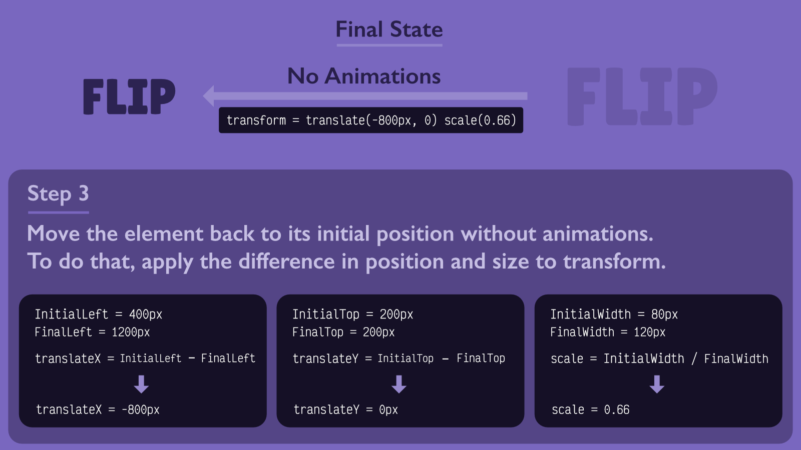
Since transform values are relative to the current element's position, we simply need to calculate the difference between the two states.
To update the element's position, for example, we need to calculate the difference between the element's coordinates (left and top) in the two states. Additionally, for the size, we need calculate the difference in width of the element between the two states.
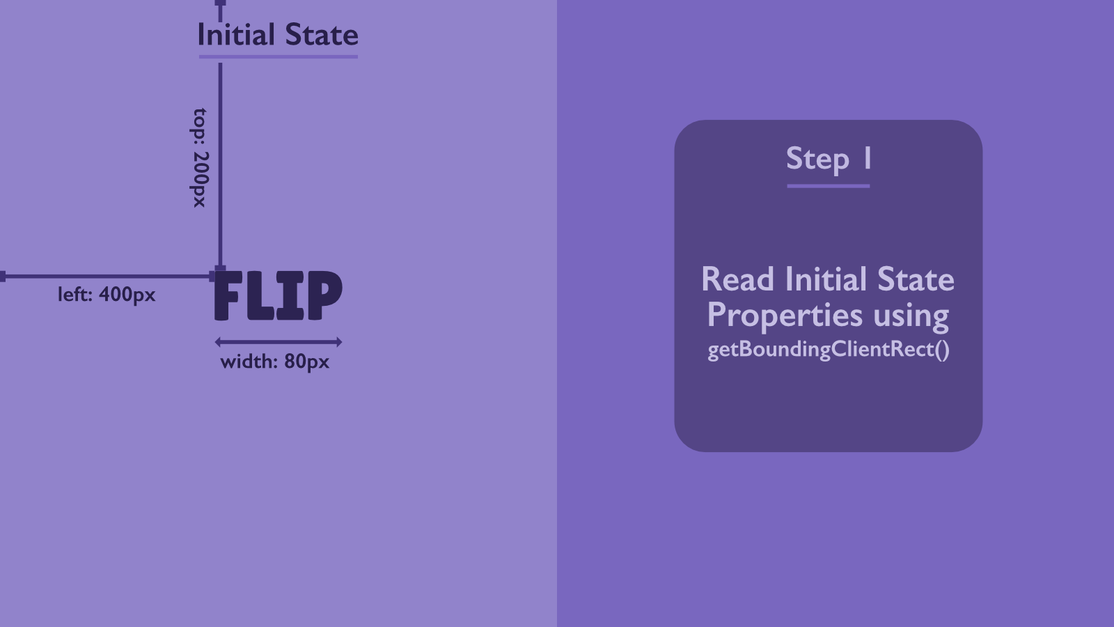
The best way to get the element's coordinates and dimensions for those calculations is by using getBoundingClientRect.
After you calculate the differences, you need to apply them to the appropriate transform properties. For example, you can use scale to adjust the size and translate to modify the position. If the elements have CSS transition enabled, the applied transform will appear to animate between the two states.
Opacity is simpler to use in this case. You just need to set the initial value for the initial state and the final value for the final state.
But when should we apply the new state?
Applying the new state means adding a class to the element, like .card--expanded in our example. Applying the transform with the calculated values alone doesn't achieve that. So the question is, how do we apply the transform and apply the new state?
That's why we have to invert before running the animation. Inverting means switching to the final state and then applying the new transform values.
For our example, it would be adding .card--expanded to the card and then updating the transform values for the card and its children. However, for that to work, we need to invert the calculated difference values between start and end states. In other words, instead of using finalState.left - initialState.left, we would use initialState.left - finalState.left.
Let me recap how FLIP works using the acronym:
- First: collect the properties of the initial state of the elements, such as position and width.
- Last: collect the properties of the final state of the elements.
- Calculate the differences between the collected properties.
- Invert: switch the element to the final state. In this case, it would be adding
.card--expandedto our card. - Use the calculated transform and opacity values on the elements.
- Enable animations on the card. In our example, it would be by adding
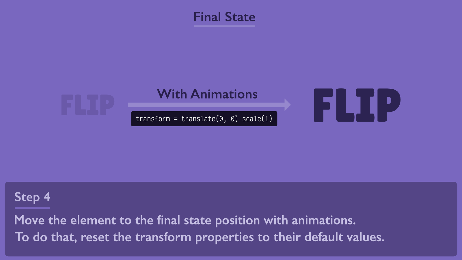
.card--animatableto the card element. - Play: run the transition animation by updating the transform and opacity properties on the elements. Updating means reseting the transform properties to their default values, such as
translate(0, 0) scale(1). When you reset them, the elements will return to their original position, which corresponds to the final position since the card is already in the final state.
FLIP example
Before we continue with our example, let's make sure we understand how FLIP really works with an example.
In this example, we have an element with text in it. This element has two states: start and end states.
When the element switches to the end state, it moves by 800px to the right and its font size changes from 20px to 30px.
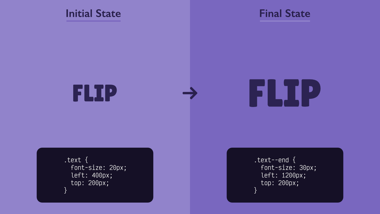
To add a transition animation between these two states using FLIP, we need to do the following.
First, collect the properties of the initial state.
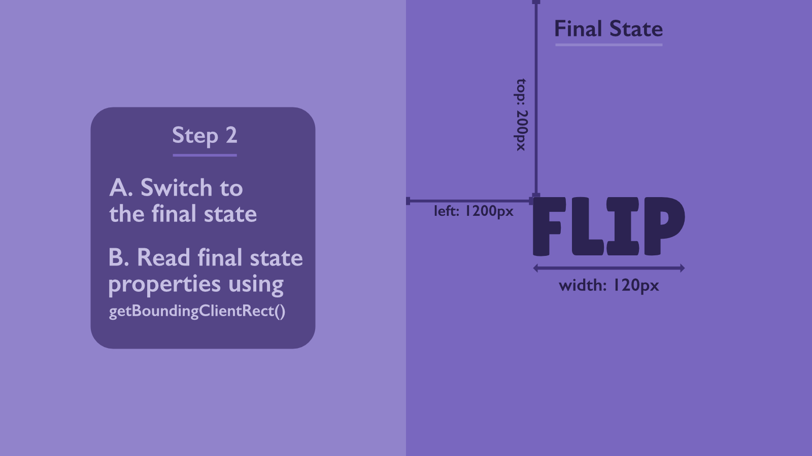
Second, switch the element to the final state and collect the properties (this occurs without animations).
Third, move the element to the initial position while it's still in the final state. With this transition, the animation should be disabled.
Lastly, start the transition to the final position with the animations enabled.
Applying FLIP in expand()
I've broken down the expand() function into smaller functions to make it easier to read and understand. These functions have not been implemented yet, but we will implement them in the next sections.
function expand() {
  // Add transitionend event listener to remove styles
  // when the animation is done
  getCardContent().addEventListener('transitionend', onExpandTransitionEnd)

  disablePageScroll()

  // Collect the properties for the collapsed card.
  // These properties will be used for transform, opacity, and clipPath
  collectInitialProperties()

  // Switch the card to the expanded state
  expandedCard.classList.add('card--expanded')

  // Collect the properties for the expanded card
  collectFinalProperties()

  // Set transform and opacity on the expanded card.
  // This step will move the elements back to their
  // original positions when it was collapsed
  setInvertedTransformAndOpacity()

  // Clip the card content to look like it's collapsed,
  // even though the card is actually expanded
  clipCardContent()

  // Run the following code in the next frame
  requestAnimationFrame(() => {
    expandedCard.classList.add('card--animatable')
    // Expanding is just resetting the values of
    // transform, opacity, and clipPath
    startExpanding()
  })
}
In the code above, we are following the FLIP sequence like this:
- Read the initial properties in
collectInitialProperties(). - Read the final properties by switching it to the expanded state and calling
collectFinalProperties(). - Invert styles by calling
setInvertedTransformAndOpacity()andclipCardContent(). Calling these functions wouldn't run animations because.card--animatableis not set yet. - Play the transition animation by calling
startExpanding()after enabling animations.
It's important to note that the animation would not work if we didn't wrap startExpanding() with requestAnimationFrame, because setting styles in startExpanding() would cancel the styles set in setInvertedTransformAndOpacity() and clipCardContent(). By requesting a new frame, we tell the browser to apply the styles set in setInvertedTransformAndOpacity() and clipCardContent() first, and then apply the styles set in startExpading().
Collecting initial and final properties
We will collect these properties in the variables initialProperties, finalProperties, and cardClip. So let's add them above.
let initialProperties = []
let finalProperties = []
let cardClip
Next, let's implement the collectInitialProperties() function.
function collectInitialProperties() {
  for (const element of getAnimatableElements()) {
    initialProperties.push({
      rect: element.getBoundingClientRect(),
      opacity: parseFloat(window.getComputedStyle(element).opacity)
    })
  }

  const cardRect = expandedCard.getBoundingClientRect()
  cardClip = {
    top: cardRect.top,
    right: window.innerWidth - cardRect.right,
    bottom: window.innerHeight - cardRect.bottom,
    left: cardRect.left
  }
}
For each animatable element (elements with .js-animatable class), we need to store their DOMRect and opacity values in an object and push it to the initialProperties array.
And for the clip-path animation, we need to store the clip path for the original card position in the cardClip variable.
The collectFinalProperties is the same as the above one except that we don't need to re-read the card's clip-path.
function collectFinalProperties() {
  for (const element of getAnimatableElements()) {
    finalProperties.push({
      rect: element.getBoundingClientRect(),
      opacity: parseFloat(window.getComputedStyle(element).opacity)
    })
  }
}
Setting the inverted styles
After calling expandedCard.classList.add('card--expanded'), the card will switch to the expanded state. We want it to be in that state while showing how it got there with animations. That's why we need to bring all elements back to their original positions while in the expanded state.
To do that, we invert the styles in setInvertedTransformAndOpacity() and clipCardContent().
function setInvertedTransformAndOpacity() {
  for (const [i, element] of getAnimatableElements().entries()) {
    // Calculate the difference for left, top, and width
    const left = initialProperties[i].rect.left - finalProperties[i].rect.left
    const top = initialProperties[i].rect.top - finalProperties[i].rect.top
    const scale =
      initialProperties[i].rect.width / finalProperties[i].rect.width

    // Use the calculated values here
    element.style.transform = `
      translate(${left}px, ${top}px)
      scale(${scale})
    `

    // Set the opacity to the initial opacity of the element
    element.style.opacity = `${initialProperties[i].opacity}`
  }
}

function clipCardContent() {
  getCardContent().style.clipPath = `
    inset(${cardClip.top}px ${cardClip.right}px ${cardClip.bottom}px ${cardClip.left}px round 5px)
  `
}
Play the animation
After inverting the styles, we need to play the animation by resetting their values. Doing so will make them move back to their original positions in the expanded state, which is what we want.
We reset the values in the startExpanding() function. But before that, we need to enable animations by adding the card--animatable class to the card.
expandedCard.classList.add('card--animatable')
Here's the code for the startExpanding() function:
function startExpanding() {
  for (const [i, element] of getAnimatableElements().entries()) {
    element.style.transform = 'translate(0, 0) scale(1)'
    element.style.opacity = `${finalProperties[i].opacity}`
  }

  getCardContent().style.clipPath = 'inset(0)'
}
Remove the styles when the animation ends
After the expanding animation is done, we don't need to keep the styles set on the elements. Those styles were only used for animation purposes.
function onExpandTransitionEnd(e) {
  const cardContent = getCardContent()
  // Check if the transition ended for the
  // card content element, which would be the clip-path animation
  if (e.target !== cardContent) return

  // Disable animations
  expandedCard.classList.remove('card--animatable')

  cardContent.removeEventListener('transitionend', onExpandTransitionEnd)

  removeStyles()
}

function removeStyles() {
  for (const element of getAnimatableElements()) {
    element.style = null
  }

  getCardContent().style = null
}
Disable the page scroll
The last function to implement in expand() is the disablePageScroll() to disable page scrolling while the card is expanded.
function disablePageScroll() {
  document.body.style.overflow = 'hidden'
}

function enablePageScroll() {
  document.body.style.overflow = ''
}
The expanding part is ready now. You can test your work to see if expanding the card works.
Next, let's handle collapsing the card.
Handling collapse
Collapsing the card requires less work than expanding it because we've already collected the needed properties to run the animation. The difference here would be inverting the order of setting the styles.
Before showing you the code, it's important to know that switching to the collapsed state (by removing .card--expanded) should happen after the animation is done.
function collapse() {
  getCardContent().addEventListener('transitionend', onCollapseTransitionEnd)

  setCollapsingInitialStyles()

  requestAnimationFrame(() => {
    expandedCard.classList.add('card--animatable')
    startCollapsing()
  })
}
The initial state styles would be the idle state of the expanded state, which is the default values for transform, opacity, and clip-path.
function setCollapsingInitialStyles() {
  for (const element of getAnimatableElements()) {
    element.style.transform = `translate(0, 0) scale(1)`
  }

  getCardContent().style.clipPath = 'inset(0)'
}
The final state styles would be the same as the initial state styles when expanding it. And since we already have these properties and implemented the update functions, we can just reuse them here.
function startCollapsing() {
  setInvertedTransformAndOpacity()
  clipCardContent()
}
When the animation ends, we need to switch the card to the collapsed state, disable animation, remove animation styles, enable the page scroll, and clean up the variables.
function onCollapseTransitionEnd(e) {
  const cardContent = getCardContent()
  if (e.target !== cardContent) return

  expandedCard.classList.remove('card--animatable')
  expandedCard.classList.remove('card--expanded')

  cardContent.removeEventListener('transitionend', onCollapseTransitionEnd)

  removeStyles()
  enablePageScroll()

  cleanup()
}

function cleanup() {
  expandedCard = null
  cardClip = null
  initialProperties = []
  finalProperties = []
}
This is just an example
The FLIP animation technique is a great tool when you want to create a smooth animation between different states. In this article, I showed you an example of how it's used to achieve this. I encourage you to find a challenging transition animation UI and try to implement it using FLIP. This is the best way to learn and improve your skills.